Beyond banking to connect people and cultural experiences across Brazil
Context
The goal of this project was to connect Itaú’s financial ecosystem with a more democratic and personalized travel planning experience, creating a digital service that is both emotionally engaging and practically useful.
Although Itaú sponsors several major events in Brazil, a large portion of young people are unable to attend due to high travel costs. Expenses like transportation, lodging, and food form a barrier that, without proper financial planning, makes the trip unfeasible. Moreover, there was no existing platform that helped users plan and finance their trips in an integrated and personalized way.
User Research
To validate the problem and understand user behavior, I conducted a quantitative survey with 37 respondents and carried out netnographic research on social media. I asked users about their travel habits, financial barriers, and their current use of finance and travel apps.
Key findings included:
76% said they would use an app that helps with travel planning
Cost of flights (40%) and accommodation (27%) were top barriers
45% reported not using any kind of finance organization app
These insights revealed a strong opportunity to offer a solution that simplifies financial planning while promoting access to cultural experiences.
Competitive Analysis
I benchmarked key competitors like Nubank Ultravioleta, C6 Carbon, PicPay, Banco Inter, and Santander Way. While most of them offer cashback, credit lines, or travel benefits, none are truly focused on travel planning + gamified savings. This created an opportunity to position Itaú as a distinctive player in this space.
Personas
Based on user data, I developed two key personas that represent the spectrum of needs:
Lucas, 24
The Festival Fan
“I see my friends traveling to festivals and I really wish I could go too, but I always lack the money or planning.”
R$3,200/month income
Loves festivals but lacks financial planning habits
Prefers intuitive, hassle-free digital tools
Mariana, 29
The Explorer
“I really want to go to the festivals I see online, but everything is more expensive for those who live far from the big cities.”
R$6,800/month income
Lives far from major cities, which increases travel costs
Plans ahead and seeks tools that support her regional context
User Journey
To ensure a human-centered experience, I mapped the full journey of a persona named Laura, from first seeing an ad for the service to post-event engagement.
Main stages:
Discovery via social media
Exploring features
Setting financial goals
Planning & gamified savings
Booking with financing
Attending the event
Sharing the experience afterward
Each touchpoint was designed to balance utility, emotion, and brand alignment.
Key Features
Guided by research insights and feasibility, I prioritized the following features:
Cost-of-living map based on destination and event
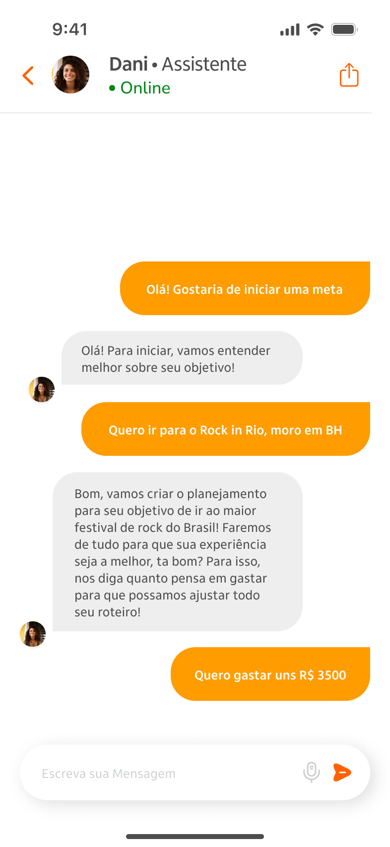
Interactive financial AI assistant for planning with goal tracking
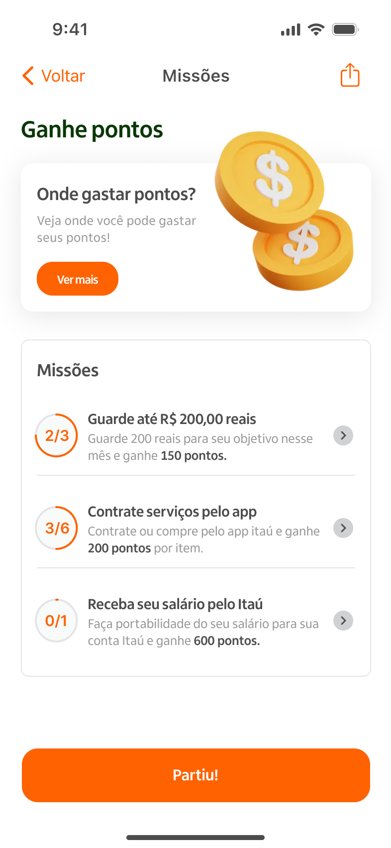
Gamification system with challenges and rewards
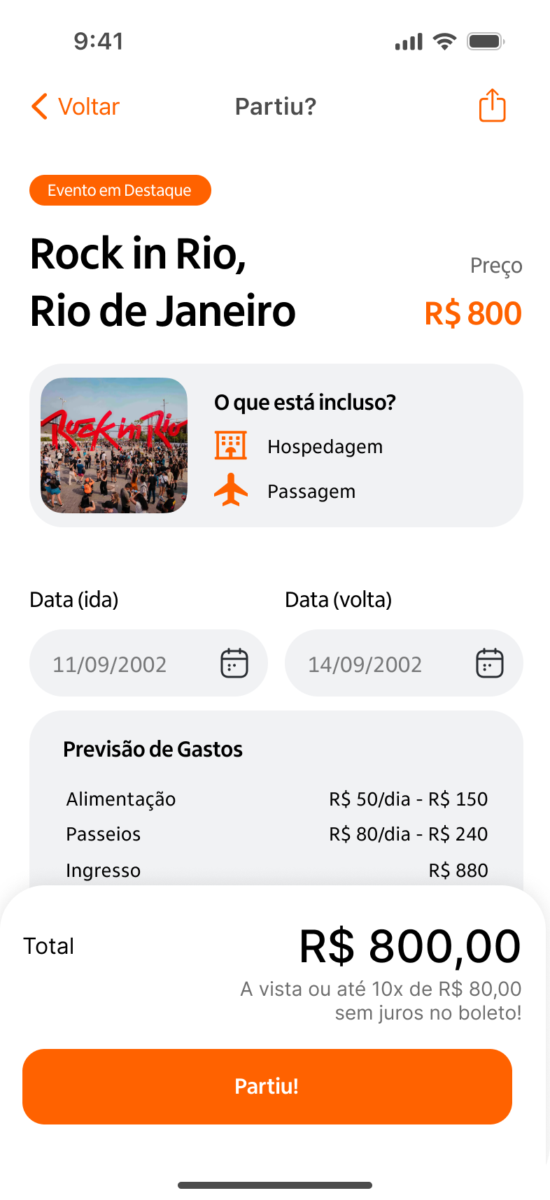
Travel financing simulator with accessible options
Exclusive perks like discounts, cashback, and ticket benefits
UI Design & Prototype
I designed a lightweight and intuitive interface using vibrant colors, clear icons, and warm illustrations to create emotional appeal. Navigation was built around three core moments: Organize, Save, and Go.
Key screens included:
Onboarding flow based on user goals
Home screen with featured events and benefits
Budget planner with gamified tasks
Checkout screen with financing options
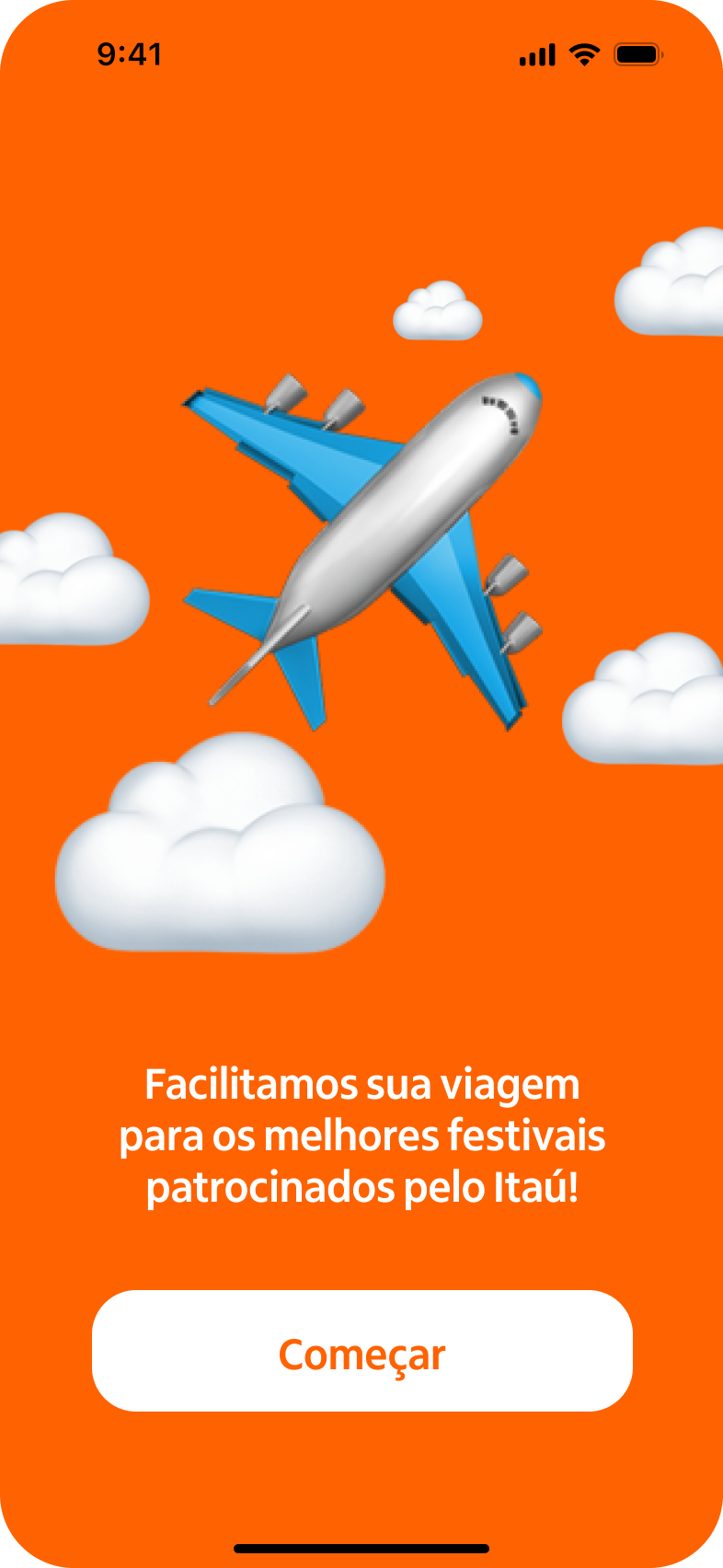
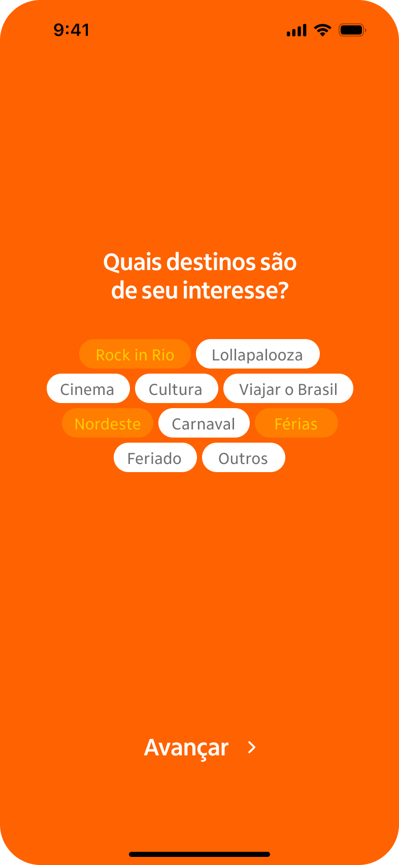
First Impressions Matter
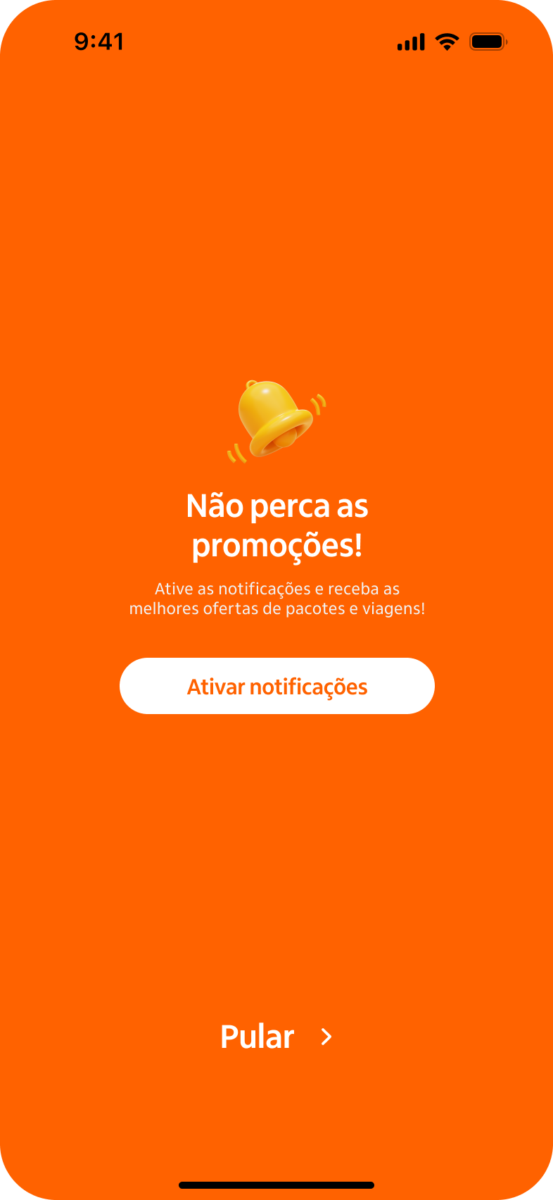
The first contact with Itaú Partiu was designed to create an immediate emotional connection with the audience. The onboarding screens were crafted to better understand each user’s profile while engaging them from the very beginning, encouraging more active participation in the program.
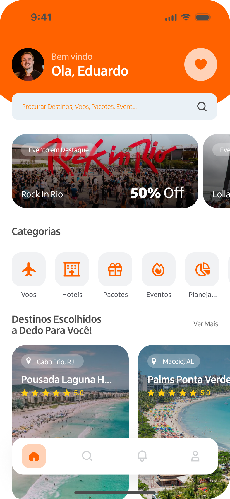
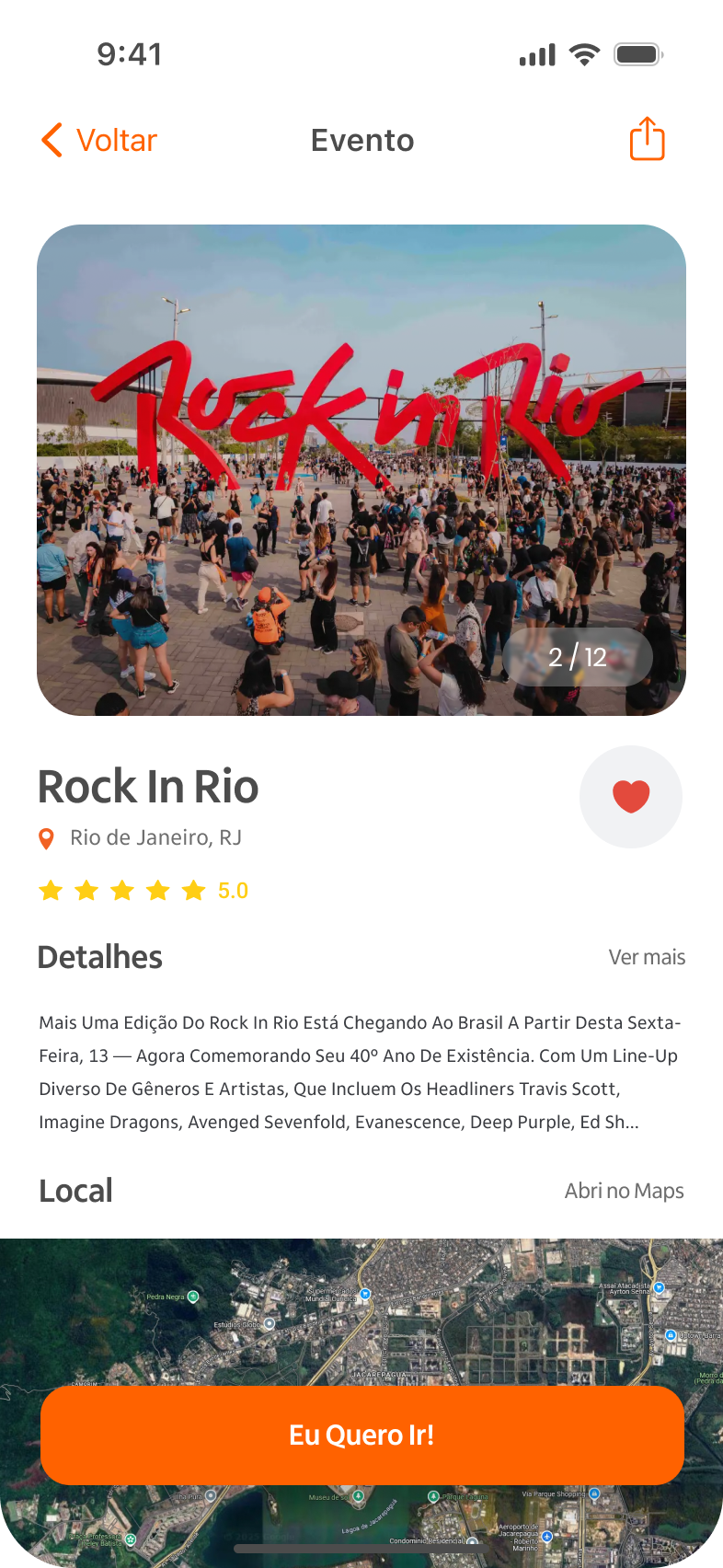
Explore and Discover
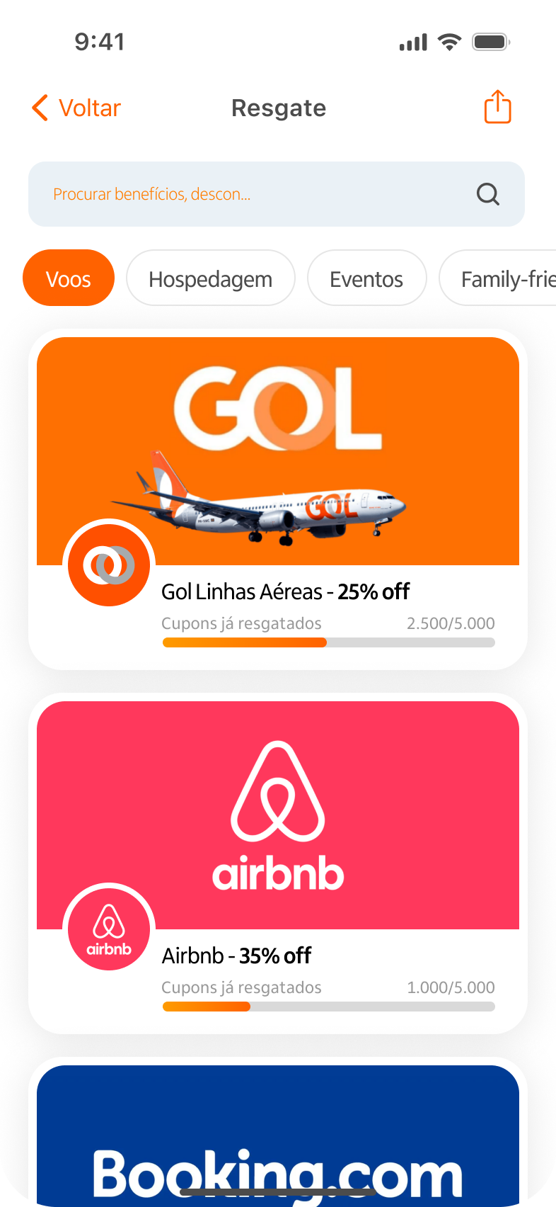
The home screen offers a light, visually pleasant, and intuitive navigation experience. Here, users can find the main festivals sponsored by Itaú, including some they might not have discovered otherwise. There’s also an exclusive benefits area with discount coupons, cashback offers, and other perks, making the overall experience even more accessible and rewarding.
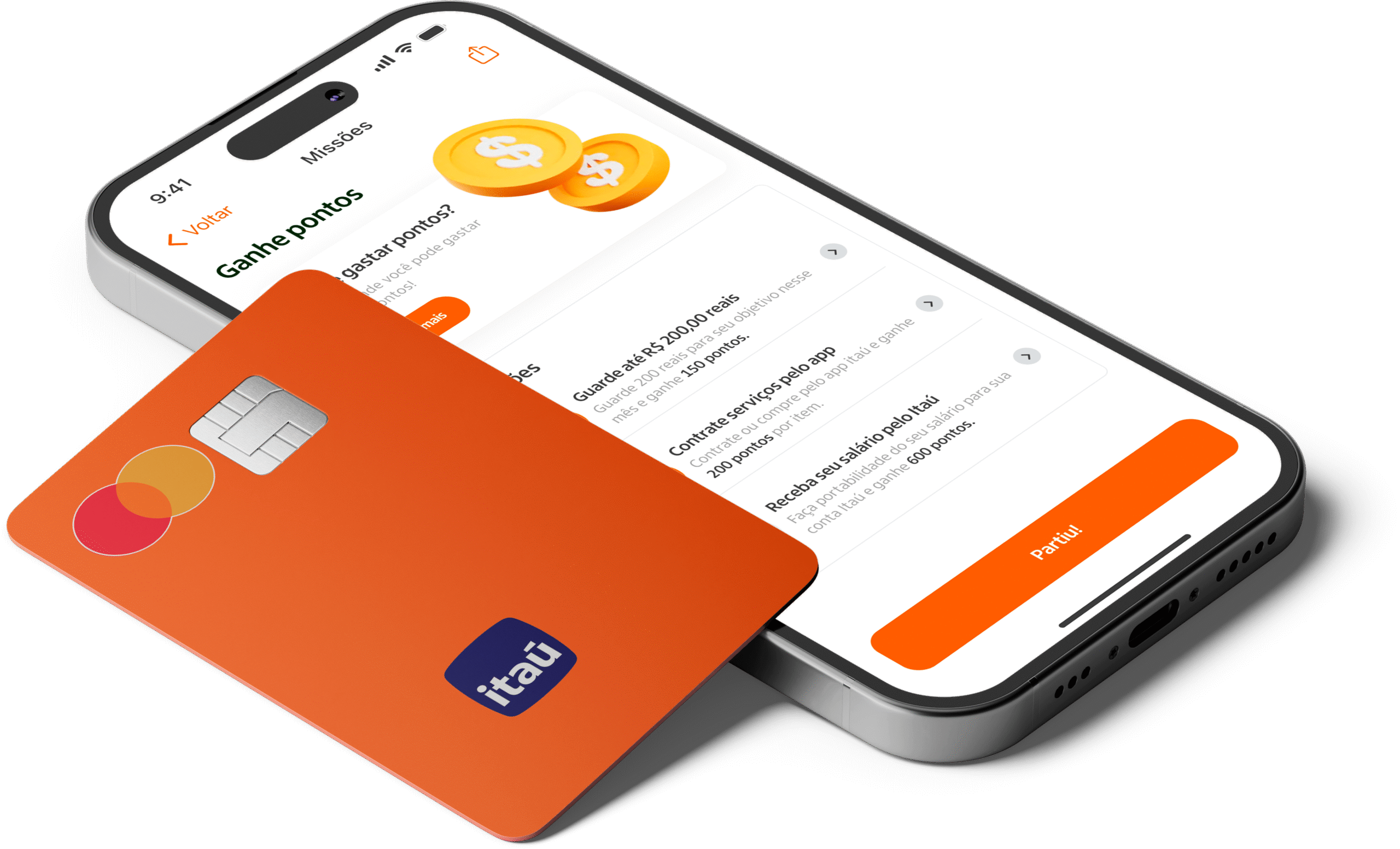
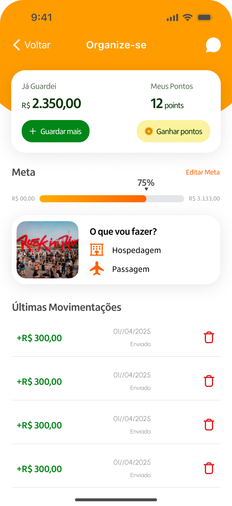
Plan, Play, and Save
This is the heart of Itaú Partiu, where innovation meets personalization. Users have access to a dedicated financial planning area specifically designed for travel, featuring gamified elements such as missions and achievements to motivate savings. An AI-powered virtual assistant supports users by helping them organize their finances, answering questions, and offering personalized tips.
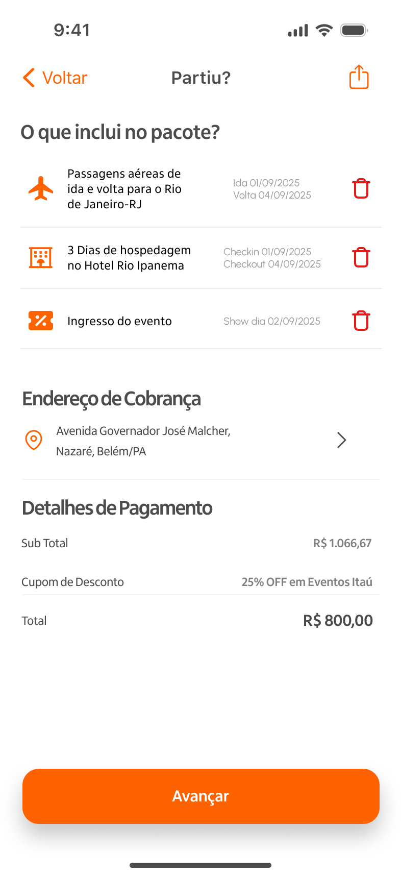
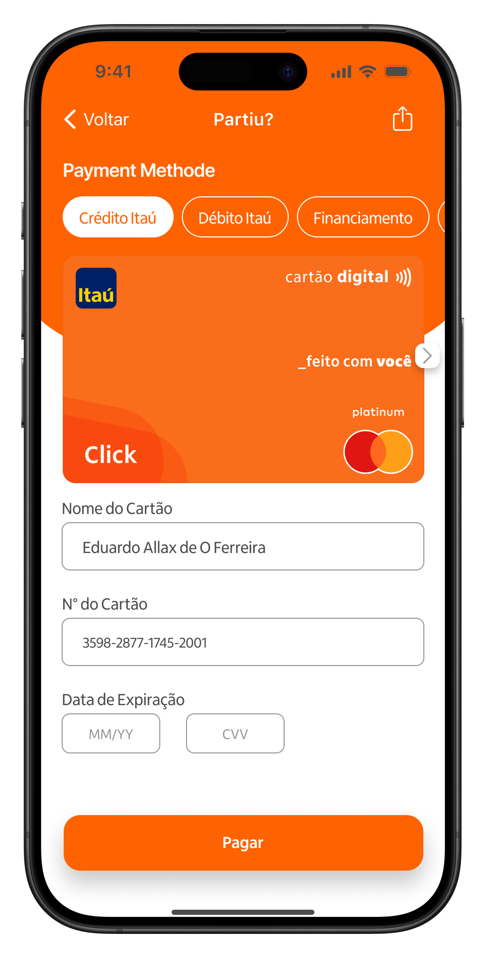
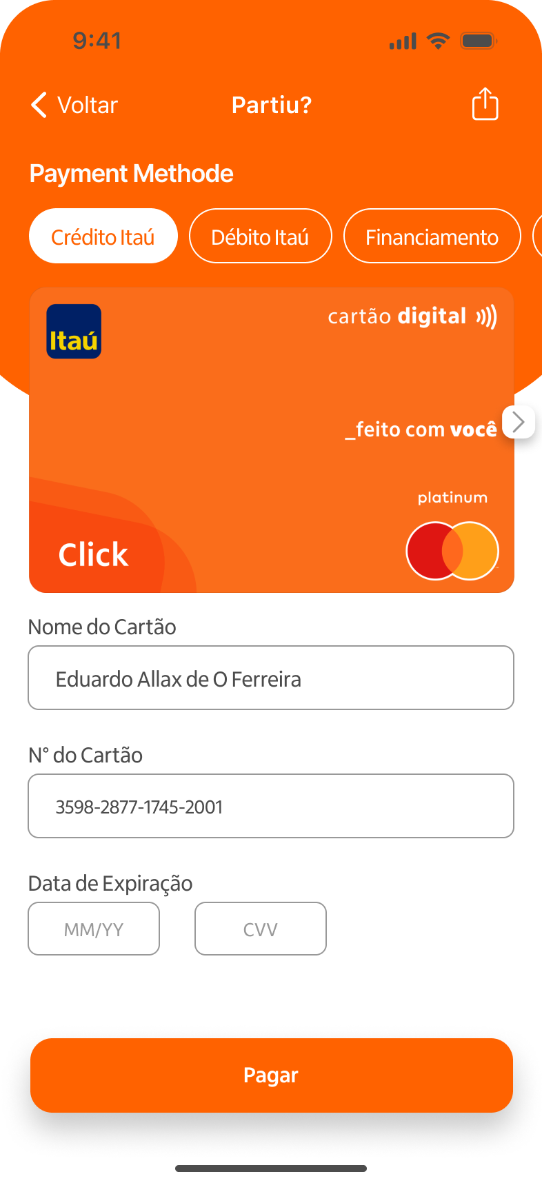
Checkout with Confidence
The checkout flow was built to be simple, fast, and accessible. Its standout feature is the option for bank-financed travel, making it ideal for users who struggle to save money ahead of time. It’s a practical solution designed to make travel possible for everyone, regardless of their current financial situation.
Expected Outcomes
Although this was an academic project, expected outcomes for a real-world implementation would include:
Higher adoption of trip financing among young Itaú clients
Reduction in trip dropouts due to financial planning issues
Increased engagement with Itaú-sponsored events
Improved brand perception as a youth-friendly cultural enabler
Learnings & Next Steps
This project taught me the importance of combining quantitative insights with deep empathy. The research phase transformed a broad idea into a focused product vision with real impact. In a next iteration, I would validate the prototype with real users, test gamification effectiveness, and explore integration with actual bank data to simulate financing in real time.
The complete project development and rationalization process (in Pt-BR) is available at this link.
Eduardo Allax
UI Design • UX Design
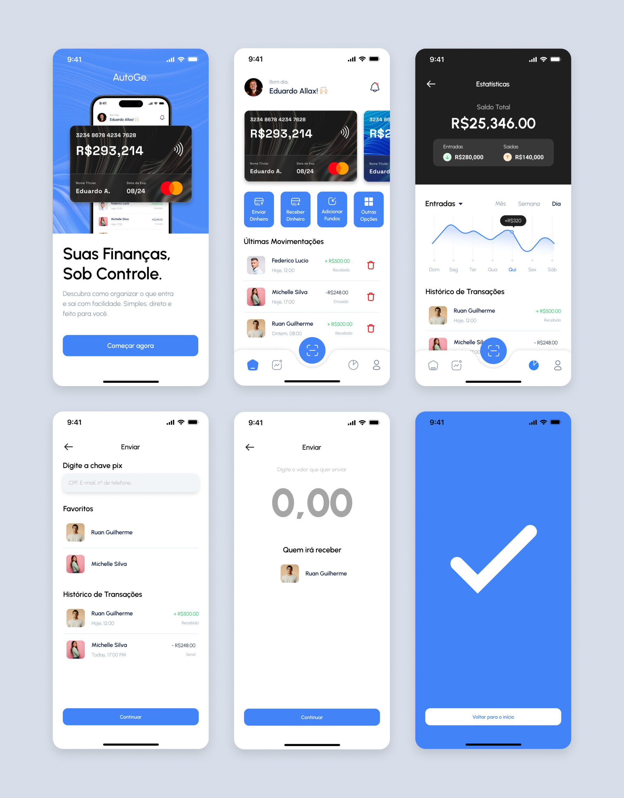
This project is a hands-on UI and UX Design study focused on developing a financial organization app. The goal was to practice screen creation using Figma, designing a “happy path” flow — that is, an ideal user journey without friction.
I created 6 screens showcasing the app’s core features: income and expense overview, payment tracking, and smooth navigation between sections. The project aimed to deliver an intuitive interface, with clear visual hierarchy, functional use of color, and elements that support smart, practical financial decision-making.