Visual Identity for a Noble-Spirited Horse Ranch
COMPANY
my role
tools
timeline
Description
Context
Haras Kirk is a venture that blends sophistication, tradition, and a deep passion for horses. The client sought a brand that could communicate these values with elegance and personality, while maintaining the visual strength and simplicity required for versatile applications.
From the initial conversations with Maurício Mattar, it became clear that the brand should carry noble symbols inspired by heraldry, yet interpreted through a contemporary and clean lens. The identity had to be memorable, strong, and capable of resonating instantly with its target audience.
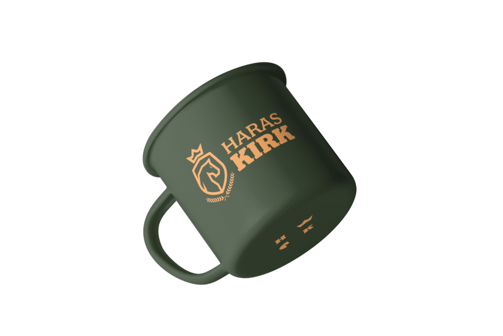
The visual proposal was grounded in elegance and respect for equestrian tradition. Elements such as crests, horses, and serif typography were explored with balance, resulting in a refined composition. The choice of shapes honors classical heritage while using simplified, modern lines.
The logo features a centered crest, symbolizing strength, nobility, and trust. The symmetrical composition conveys stability, while the uppercase serif typography evokes prestige. The brand was designed in both positive and negative versions to ensure versatility across light and dark backgrounds.
Even without the use of vibrant colors, the brand conveys presence and elegance through balanced composition and typographic choices. The visual identity was designed to perform well whether embossed on paper or embroidered on fabric, aligning with the haras’s traditional setting and physical presence at equestrian events.
The Haras Kirk brand visually expresses what the physical space already represents: class, care, and tradition. The result is a timeless identity with versatile applications tailored for the high-standard equestrian universe. It’s a memorable brand with strong recall and practical usability.