Website Redesign • Higher Education Institution based in Conselheiro Lafaiete, Brazil
COMPANY
Centro de Ensino Superior de Conselheiro Lafaiete (CESL-CL)
my role
UX/UI Designer
tools
Elementor
Miro
Google Forms
Photoshop
timeline
2022
Description
A full UX/UI revamp focused on usability, student needs, and converting prospective applicants.
Context
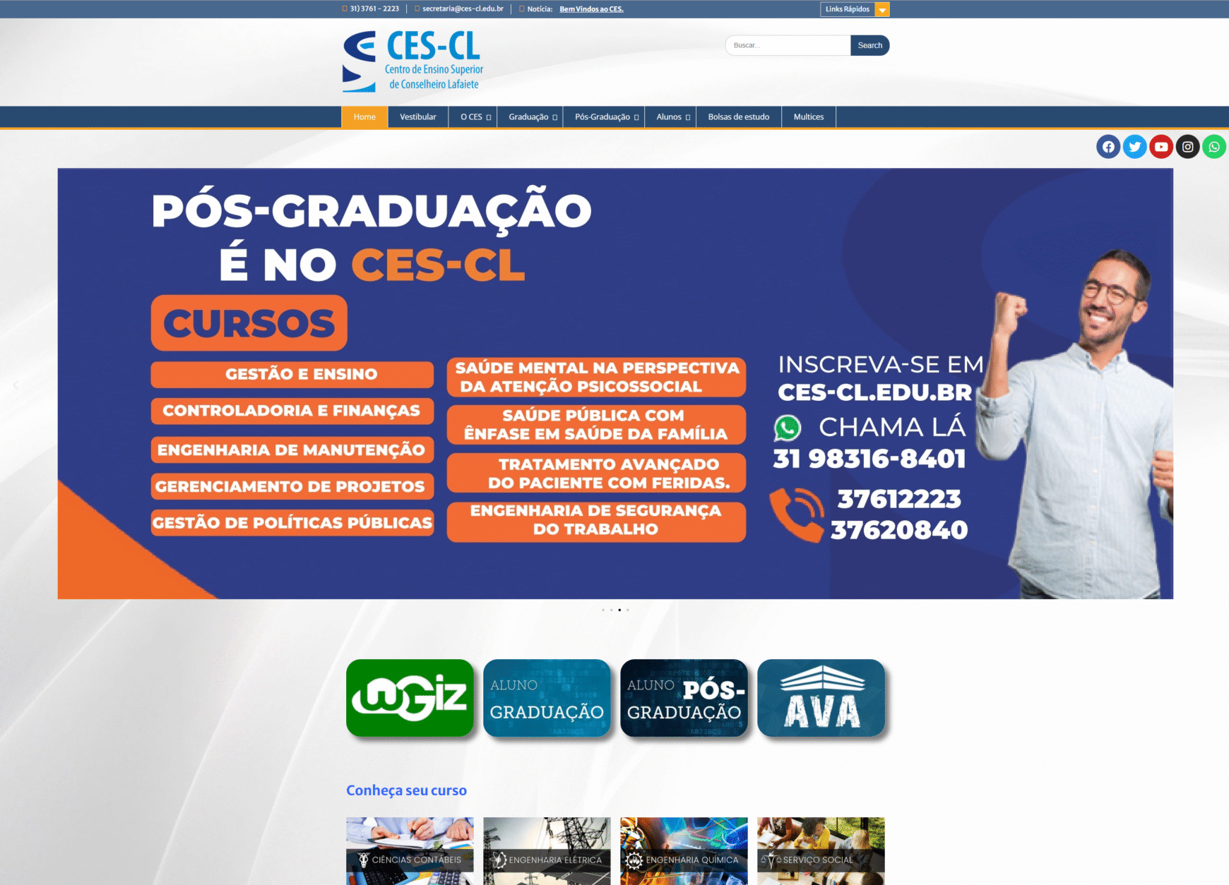
To celebrate its 20th anniversary, CES-CL needed a modern and functional website. The redesign aimed to improve navigation, prioritize access to student services, and better represent the institution to future students.
Challenge
CES-CL’s old website was cluttered, visually outdated, and made it hard to find key information. The challenge was to turn this outdated experience into a functional platform that prioritized student needs and helped attract new prospects.
Process
Heuristic analysis — Identified core usability and structural issues in the original site.
User research — Interviewed current students and prospects to understand their real needs.
Navigation redesign — Rebuilt the information architecture to align with user flows and clarity.
Visual prioritization — Placed the student portal button in the header and highlighted courses for new visitors.
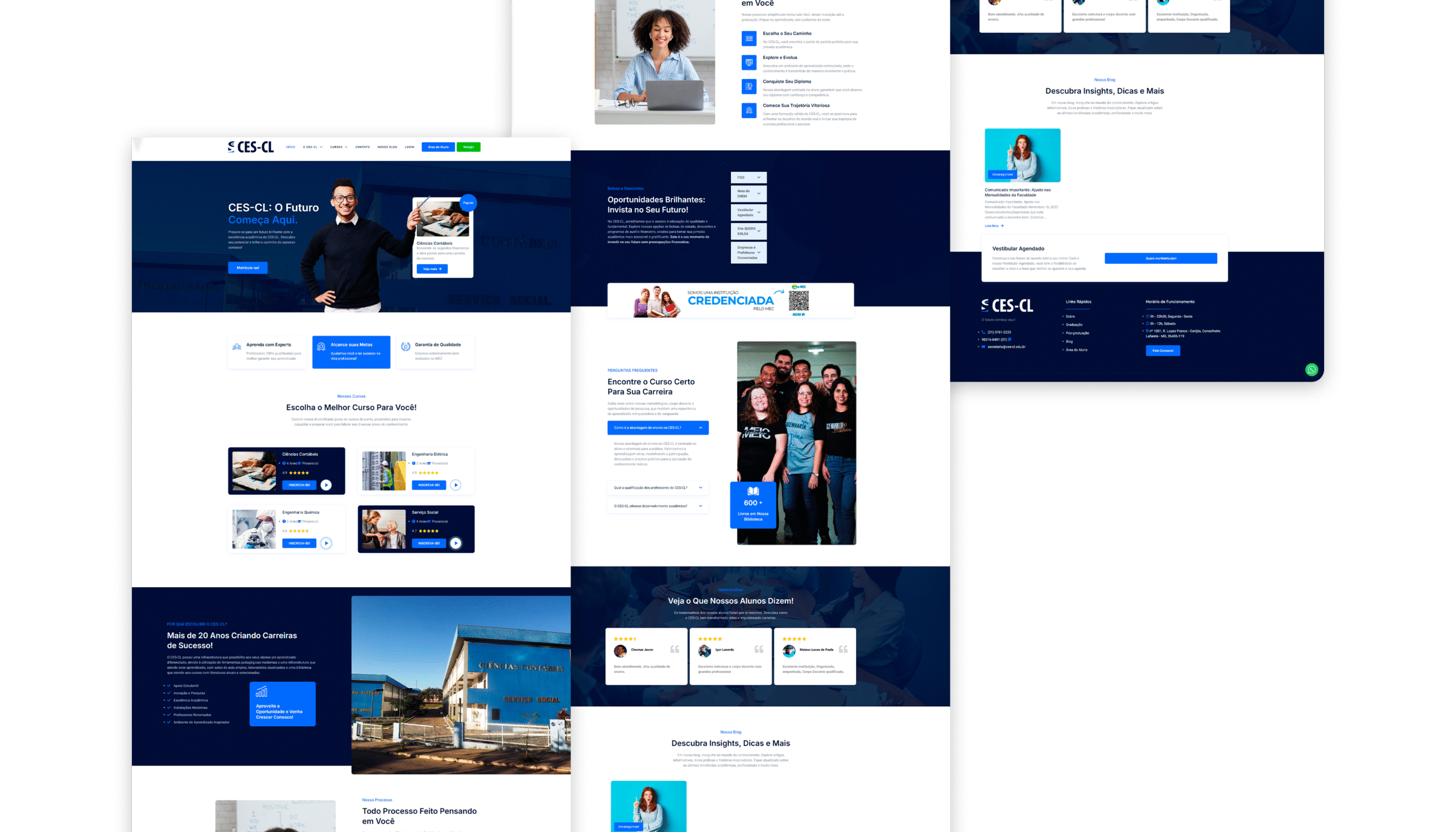
Solution
The new website is responsive, lightweight, and easy to navigate. I introduced a Student Area with direct access to schedules, announcements, and subjects, centralizing key services. For new users, the navigation is clean and intuitive, making it easier to discover courses and understand what the institution offers.
Results
Access to the student portal became faster, and course pages saw increased engagement. Navigation flows improved significantly, and students praised the clarity and organization of the redesigned interface.
Eduardo Allax
UI Design • UX Design
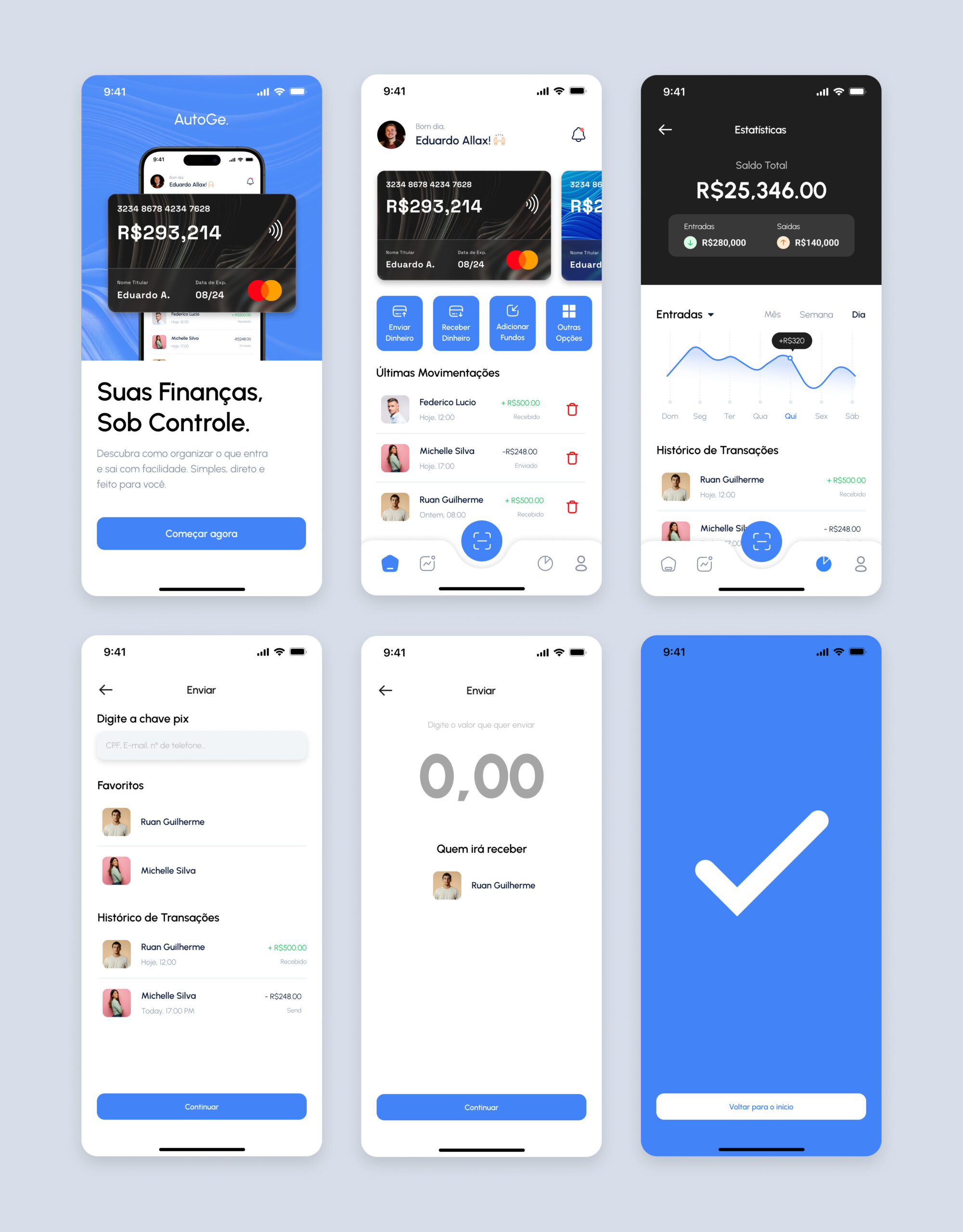
This project is a hands-on UI and UX Design study focused on developing a financial organization app. The goal was to practice screen creation using Figma, designing a “happy path” flow — that is, an ideal user journey without friction.
I created 6 screens showcasing the app’s core features: income and expense overview, payment tracking, and smooth navigation between sections. The project aimed to deliver an intuitive interface, with clear visual hierarchy, functional use of color, and elements that support smart, practical financial decision-making.