We repositioned Criar with a modern, minimalist, and meaning-rich brand identity.
Context
Criar is a Brazilian technology company with over two decades of experience. Over the years, the brand has earned recognition in its field, but its visual identity no longer reflected the innovation and growth present in its services. The rebranding emerged as a response to the need to visually communicate this evolution while preserving its essence.
Challenge
The goal was to update Criar’s logo while preserving the brand’s integrity, and crafting an identity that communicates innovation, professionalism, and sophistication. The challenge was to design a timeless and flexible solution, suitable for various platforms and meaningful within the digital landscape.
Process
Immersion – Research on the brand’s history, competitor analysis, and market study.
Concept Development – Definition of the visual and symbolic attributes to be enhanced or preserved.
Visual Exploration – Sketches, typographic experiments, and geometric form studies.
Grid Construction – Logo development based on the golden ratio for balanced visual harmony.
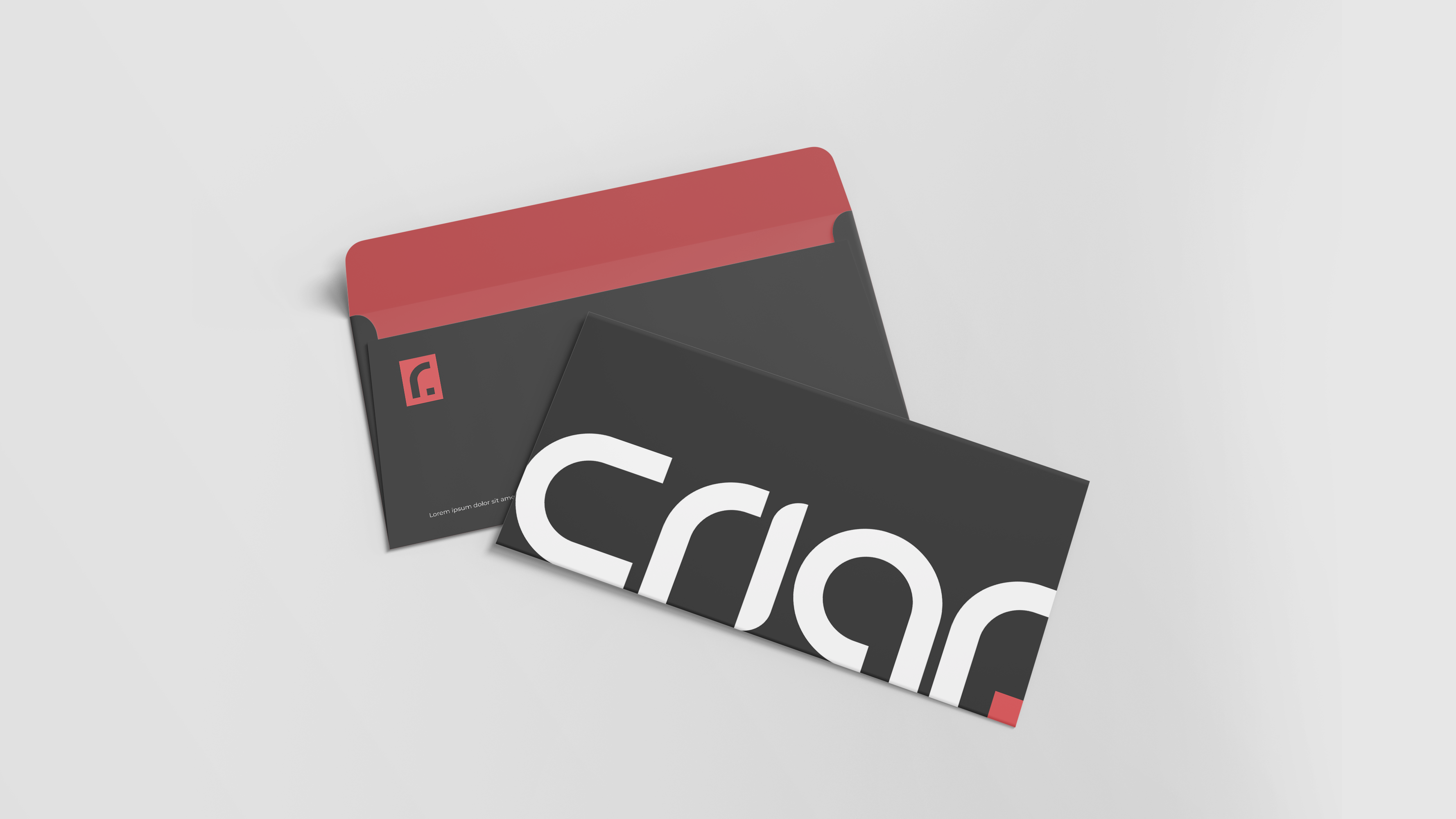
Integrated Symbol – Inclusion of the boomerang into the letter “R” to symbolize precision, return, and the development cycle.
Color Palette – Retention of the brand’s original red with a modern twist (Poppy Red), complemented by black as a secondary color.
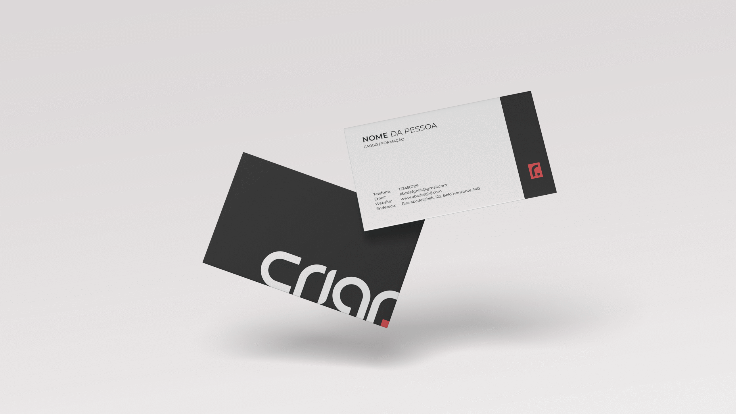
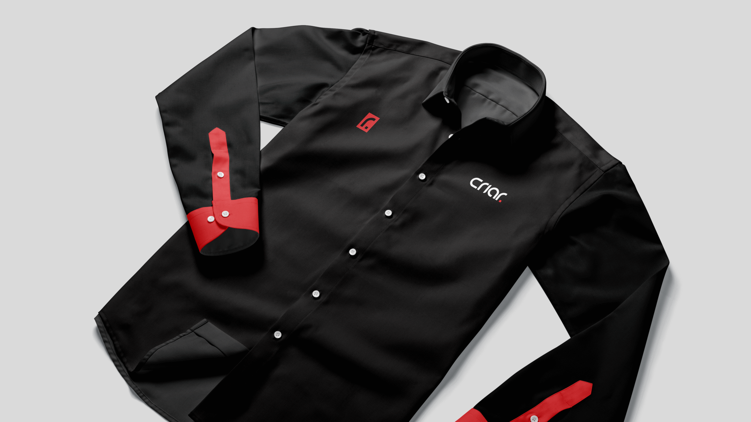
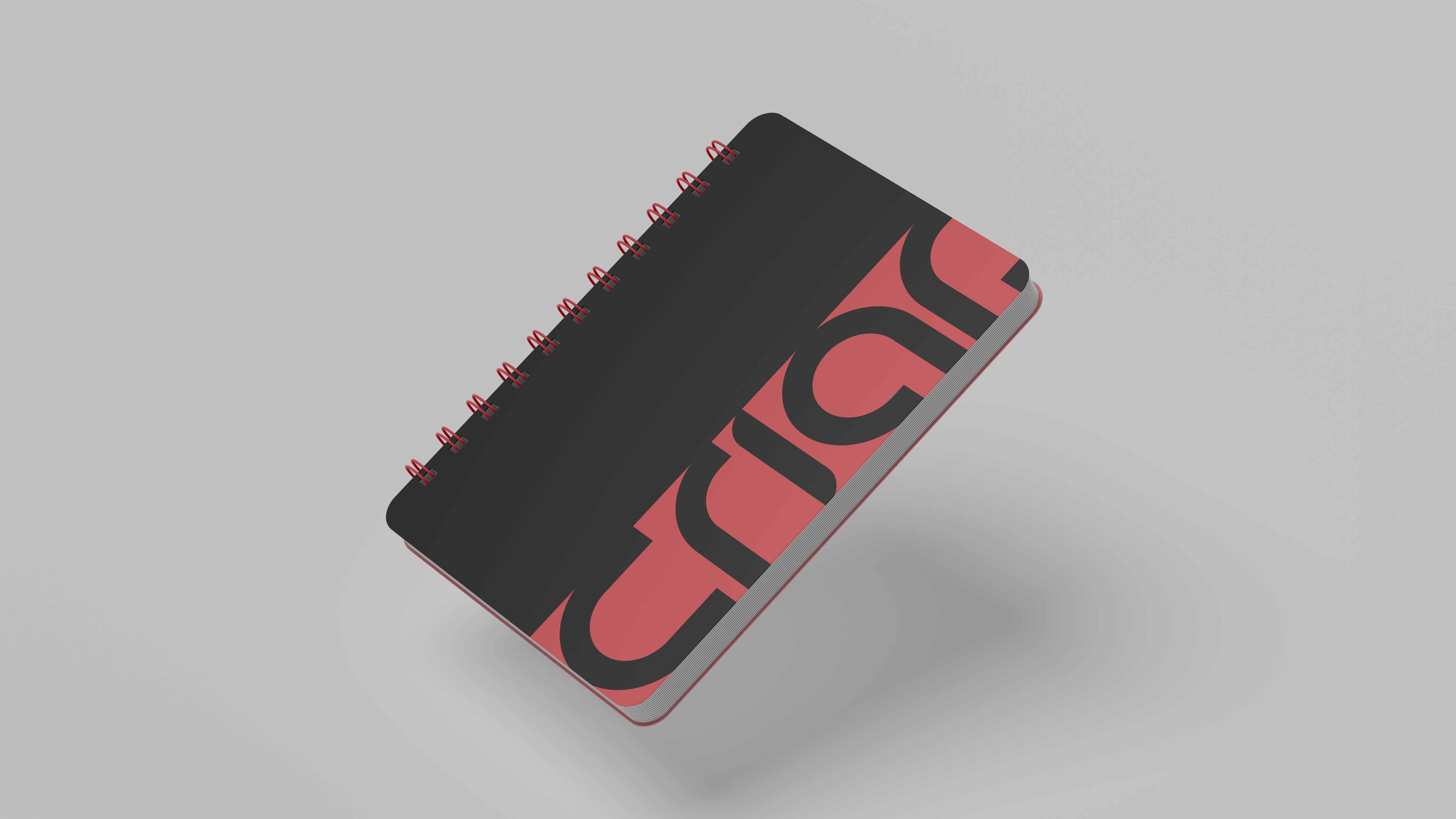
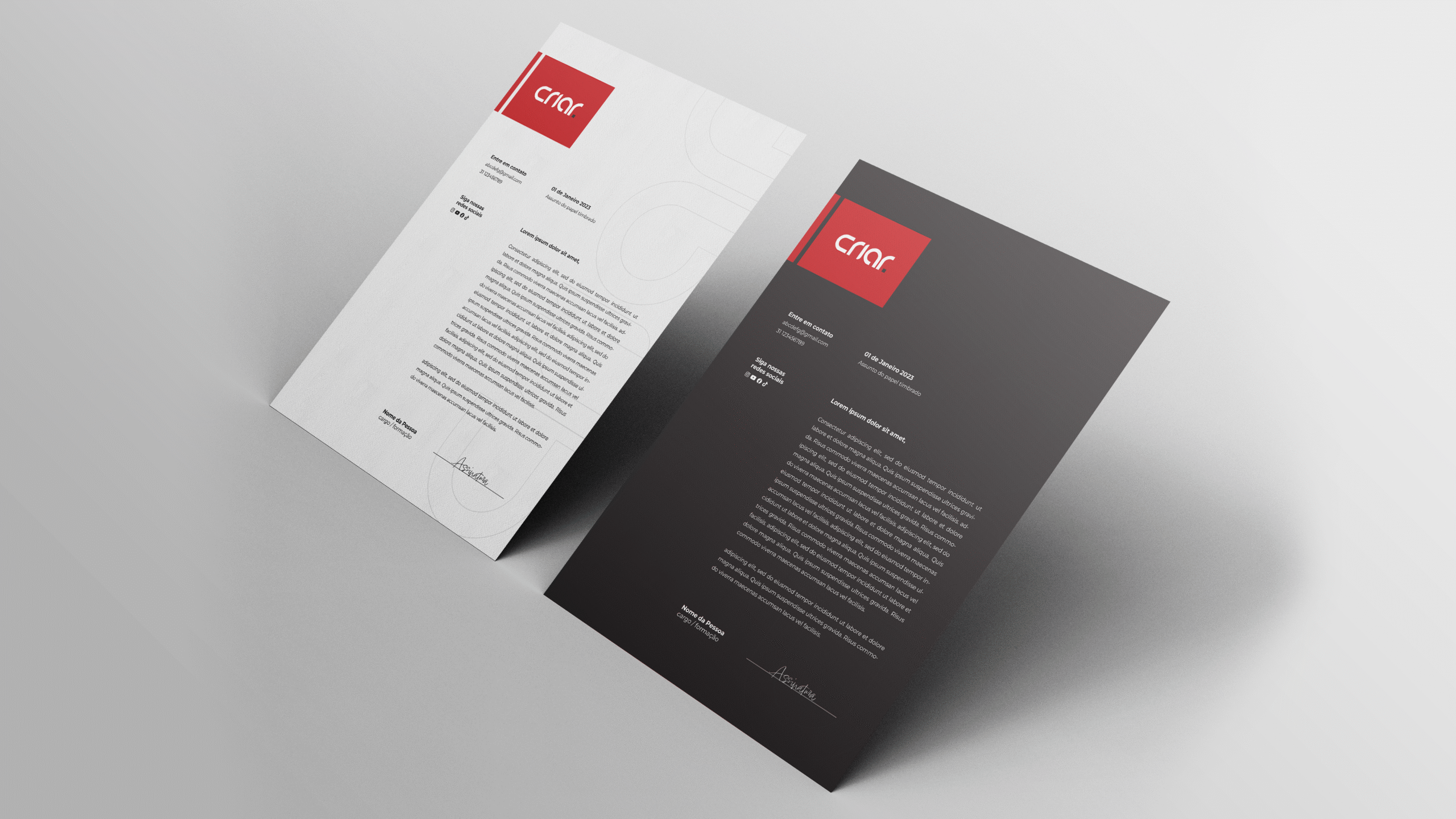
Applications – Testing the identity across various touchpoints: digital, print, and corporate environments.
Solution
The new Criar identity reflects the essence of a modern tech company: precise, approachable, and ready for the digital market’s challenges. The minimalist logo is bold, symbolic, and highly functional. The curved typography communicates fluidity, while the pixel/boomerang element in the letter “R” reinforces technical expertise. The color palette strikes a balance between tradition and boldness, ensuring recognition and strong presence.
Results
This project strengthened my strategic perspective on the role of design in repositioning established brands. By balancing aesthetics and concept, it was possible to create a relevant and long-lasting identity. Criar now has a brand that honors its legacy — but more importantly, reflects its future.
Eduardo Allax
UI Design • UX Design
This project is a hands-on UI and UX Design study focused on developing a financial organization app. The goal was to practice screen creation using Figma, designing a “happy path” flow — that is, an ideal user journey without friction.
I created 6 screens showcasing the app’s core features: income and expense overview, payment tracking, and smooth navigation between sections. The project aimed to deliver an intuitive interface, with clear visual hierarchy, functional use of color, and elements that support smart, practical financial decision-making.